DuPont
Project: Designed a user guide for testing the interaction and features of DuPont’s connected patient ecosystem, which includes a hygienic, Corian-built interactive table and an informative doorway display.
Role: Led the design of a clear, user-friendly guide, balancing technical detail with accessibility. Aligned the layout with DuPont’s branding, ensuring seamless navigation as users moved through the testing process.
Boston Dynamics
Project: Created a safety-focused user guide for Spot, Boston Dynamics’ advanced robot, emphasizing responsible handling and caution due to its potential risks.
Role: Led the design team, ensuring a serious tone through strategic color choices and visual hierarchy. Simplified complex technical and safety information while maintaining readability and accessibility.
NASA
Project: Designed a poster series to engage, educate, and reinforce opportunities within NASA, highlighting key methodologies from a collaborative research project.
Role: Led the concept development, creating a visually compelling series that incorporated schematic drawings and scientific aesthetics to communicate the importance of innovation and design thinking.
Bose
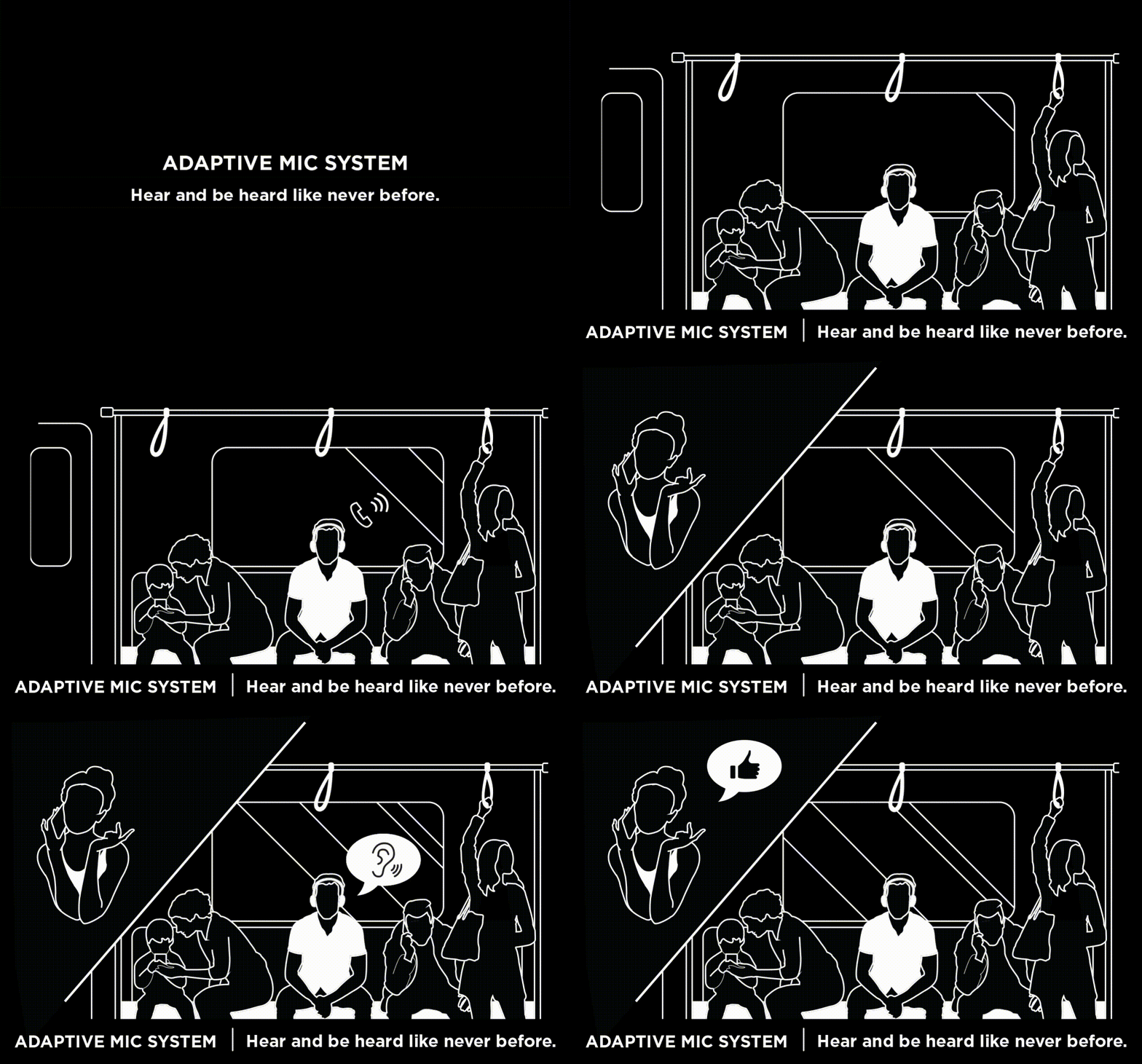
Project: Developed two interactive retail display concepts, Mirror Display and Matchmaker Display, to enhance consumer engagement while showcasing Bose products.
Role: Designed animations, illustrations, and graphics for interactive retail displays, enhancing customer engagement.
Mirror Display
For this concept I created 4 looped animations and designed the graphics that would go into the display beneath the products. The idea behind this design is to give the customer a reason to come over to play and learn. While they are checking out how they might look with a particular product, the animations I had created are playing on the mirrored surface, telling the story of how how Bose is reimagining the role of sound in people’s lives.
Matchmaker Display
I designed graphics to help customers identify the right Bose wearable for their lifestyle and need. Urban hikes, conference calls in cabs, audio books on the beach, a nap on the plane? The graphic checks off which product would best suit those situations. I also designed the extruded pattern on the backing which was meant to portray customer stories and how Bose can fit into their unique lifestyle.
MCCS
Project: Developed a brand architecture and strategy for MCCS, which provides on-base services for Marines, focusing on retail innovation and Marine-centric branding.
Role: Contributed to the creation of a comprehensive brand playbook, outlining standards for existing and potential new brands. Helped develop GSD (Get Stuff Done), a Marine-facing endorsement brand, and implemented the branding across multiple channels and product lines.
Fresenius
Project: Redesigned the therapy flowsheet for Fresenius Kidney Care’s PatientHub, a digital platform helping dialysis patients manage treatment data and stay connected with healthcare teams.
Role: Leveraged user interview feedback to create a more intuitive, visually appealing flowsheet, aiming to encourage a shift from paper-based documentation to a digital, streamlined experience.
Alexion
Project: Assisted in market research for IV therapy preparation, illustrating and animating potential simplified process concepts for infusion therapy administration.
Role: Created an animated explainer video, visually demonstrating the new preparation method to aid research and decision-making.
Peloton
Project: Collaborated with Peloton’s strategy team to enhance manufacturing efficiency through a centralized intranet system.
Role: Designed “The Center of Excellence”, a secure internal platform for employees to access resources, manage tasks, and streamline operations.
Features
Process Wireframe
Nav bar wireframes
Western Union
Project: Designed a Partner Portal to support Western Union’s shift toward an “as-a-service” payments platform, offering a unified interface for partners and employees.
Role: Led the UX strategy, defining 10 key personas and mapping user journeys based on research insights. Developed hero flows, KPIs, and UI designs to enhance partner engagement and operational efficiency.
Takeda
Project: Redesigned the Takeda Digital Learning Platform, a resource for healthcare professionals, patients, and caregivers to access self-paced and guided learning on drug therapies.
Role: Redesigned the patient learning experience for HyQvia treatment, creating a scalable, reusable framework adaptable for other Takeda brands.


